A Visual Guide for Responsive Design Using Tailwind CSS?

Tailwind CSS has definitely become a key technology for quickly building websites without writing tons of CSS but one of its most significant features is support for responsive page design.
Aside from just the theming aspects of the framework, it has a very powerful grid system powered by CSS grid to help build intuitive and flexible responsive layouts.
In this article I'll show how to use Tailwind CSS grid system to build mobile first layouts, including:
- What is Tailwind grid system.
- How does it compare with other grid systems.
- How to build multi column page layouts using the grid system.
- How to build form layouts using the grid system.
- How to build card grid layouts.
This is one of most impressive features of Tailwind compared to other frameworks I've used and worth discussing in an article. So on that note, let's learn about Tailwind Grid.
What is Tailwind Grid system?
Tailwind generates utility classes based on CSS grid templating. It simplifies the notation needed to define a grid template in CSS.
If you've ever tried to write CSS grid syntax manually it can take some time to become familiarized with all of its capabilities. Tailwind provides intuitive utility classes to make the job easier.
Why is Tailwind Grid system important?
Aside from just being another grid system with rows and columns, it's actually using CSS grid to power the grid system. Some of the benefits of using Tailwind's grid system include:
- No fixed grid column count
- Can set different column counts at different breakpoints
- Supports subgrids or nested grids.
- More natural grid auto flow than flex alternatives.
- Supports column and row spanning
- Supports auto adjusting column and row blocks for better density
Overall, Tailwind simplifies using CSS grid.
Getting Started with Tailwind Grid
The grid will use the following defaults unless otherwise customized in the main tailwind.config.js. All of the breakpoints are min-width so it's mobile first by default.
| Breakpoint | Pixels | Media Query |
|---|
| sm | 640px | @media (min-width: 640px) { ... } |
| md | 768px | @media (min-width: 768px) { ... } |
| lg | 1024px | @media (min-width: 1024px) { ... } |
| xl | 1280px | @media (min-width: 1280px) { ... } |
| 2xl | 1536px | @media (min-width: 1536px) { ... } |
A mobile first grid system defaults to the smallest screen size first, which is anything less than 640px.
This approach makes it easier to layout content for smaller screens because it usually just stacks vertically and stretches the full width of a mobile device. It's very rare that you would need any columns but there are cases I'm sure.
So as a screen reaches the first breakpoint sm, the grid can be used to add columns to space things out horizontally.
So the first point we'll start with is how to specify grid columns.
Tailwind grid basics
To apply a grid to an HTML element you can add the following utility classes.
grid: Add the grid class to provide the bases CSS.grid-cols-{*}: Add a column count specifier, Tailwind grid does not have a fixed column count and can specify any number of columns here.gap-{*}: Specifies a gap between child element items in rem unless specified as gap-2-px pixels.
Here's a mobile first example, where it specifies one column. So each child element will take up one column width and the next element will wrap to the next row creating a stacked layout flow.
<div class="grid grid-cols-1">
  <div>1</div>
  <div>2</div>
</div>
This grid will render the following stacked, full width mobile responsive layout.
Multiple columns for mobile
You can specify more columns for mobile by changing the grid-cols-1 to grid-cols-3 for example, however the content will no longer stack since there's multiple columns.
If you need more columns at mobile for a particular section of content, just use another grid. For example:
Mobile grid with different columns
<div class="grid grid-cols-1 gap-4">
<div>1</div>
<div>2</div>
</div>
<div class="grid grid-cols-3 gap-4 my-4">
<div>3</div>
<div>4</div>
<div>5</div>
</div>
<div class="grid grid-cols-1 gap-4">
<div>6</div>
<div>7</div>
</div>
Here's how using multiple grids on mobile view would render.
Spanning multiple columns
When setting a column count using grid-cols-{*} greater than one, the child elements can specify how many colunns to span using col-span-{*} utility class.
Mobile grid with multiple columns
<div class="grid grid-cols-3 gap-4">
  <div class="col-span-2">1</div>
  <div>2</div>
  <div>3</div>
</div>
As you can see, block 3 overflowed to the next row since blocks 1 and 2 used the max columns. This is why mobile views usually only use a single column to automatically force content to wrap to the next row.
Adding grid breakpoints
Now let's add the first breakpoint for a sm device like a tablet with a min-width of 640px. Add the following responsive modifier.
sm:grid-cols-12: Defines a 12 column grid for a sm breakpoint.
Make sure to keep the default grid-cols-1 utility class, since it allows the grid to default to single column for mobile.
<div class="grid grid-cols-1 sm:grid-cols-12">
  ...
</div>
To add column spanning we can just use the responsive modifier sm:col-span-{*} on each of the elements.
If a column span modifier is not specified by an element for a particular breakpoint, it will default to a single column of the current breakpoint.
I'll split the element columns evenly for the sm breakpoint.
<div class="grid grid-cols-1 sm:grid-cols-12">
  <div class="sm:col-span-6">1</div>
  <div class="sm:col-span-6">2</div>
</div>
To further expand on this example, let's add an md breakpoint and set it to md:grid-cols-12 and span the child elements as follows.
<div class="grid grid-cols-1 sm:grid-cols-12 md:grid-cols-12">
  <div class="sm:col-span-6 md:col-span-3">1</div>
  <div class="sm:col-span-6 md:col-span-9">2</div>
</div>
The same pattern can be applied for larger breakpoints as needed using:
| Breakpoint | Grid columns | Column span |
|---|
| sm | sm:grid-cols-{*} | sm:col-span-{*} |
| md | md:grid-cols-{*} | md:col-span-{*} |
| lg | lg:grid-cols-{*} | lg:col-span-{*} |
| xl | xl:grid-cols-{*} | xl:col-span-{*} |
| 2xl | 2xl:grid-cols-{*} | 2xl:col-span-{*} |
So now that we've seen how to create a grid at each breakpoint, let's create a few page layouts using this technique.
Creating responsive page layouts
Let's start with a few common layouts that are typically used for websites. These are layouts that are usually used for the following:
- Administrative with secured sidebar navigation.
- Help Documentation with sidebar navigation.
- Any website page that needs a sidebar navigation.
Most websites use a single column for home or landing pages but there are certainly cases when sidebars are essential.
Three column page layout with grid
Here's an example of a three column layout. I've added a header and footer to illustrate how a page might look.
The following code will produce a sm view or greater and will also reduce to a mobile view when less than the sm min-width breakpoint.
Small device to desktop
Mobile view
<div id="demo-main">
  <div id="demo-header">Header</div>
  <div id="demo-grid" class="grid grid-cols-1 sm:grid-cols-12 gap-4">
    <div class="sm:col-span-3">Sidebar</div>
    <div class="sm:col-span-6">Main</div>
    <div class="sm:col-span-3">Sidebar</div>
  </div>
  <div id="demo-footer">Footer</div>
</div>
Two column page layout with grid
Here's a two column grid layout with a sidebar on the left for things like an Admin dashboard or other navigation.
Small device to desktop
Mobile view
<div id="demo-main">
  <div id="demo-header">Header</div>
  <div id="demo-grid" class="grid grid-cols-1 sm:grid-cols-12 gap-4">
    <div class="sm:col-span-3">Sidebar</div>
    <div class="sm:col-span-9">Main</div>
  </div>
  <div id="demo-footer">Footer</div>
</div>
Here's a two colum grid with the sidebar navigation on the right hand side. This could typically be hidden on small devices or wrap on smaller breakpoints. The hidden content could be toggled using an overflow icon.
Small device to desktop
Mobile view
<div id="demo-main">
  <div id="demo-header">Header</div>
  <div id="demo-grid" class="grid grid-cols-1 sm:grid-cols-12 gap-4">
    <div class="sm:col-span-9">Main</div>
    <div class="sm:col-span-3">Sidebar</div>
  </div>
  <div id="demo-footer">Footer</div>
</div>
Create responsive card layouts
So this next layout is quite common for Dashboards or Blog category pages. Tailwind's grid makes it easy to arrange cards in a fluid arrangment.
Card layout for full page
Here's an example of cards being uniformely arranged in a grid layout. This is one of the benefits of using Tailwind grid because CSS grid makes these types of arrangements flow as a real grid should rather than using flex alternatives.
Card
Card
Card
Card
Card
Card
Card
Card
Full page card grid layout example
<div id="demo-cards">
  <div id="demo-header">Header</div>
  <div id="demo-card-grid" class="grid grid-cols-1 sm:grid-cols-12 md:grid-cols-12 lg:grid-cols-12 gap-4">
    <div class="sm:col-span-4 md:col-span-3 lg:col-span-2">Card</div>
    <div class="sm:col-span-4 md:col-span-3 lg:col-span-2">Card</div>
    <div class="sm:col-span-4 md:col-span-3 lg:col-span-2">Card</div>
    <div class="sm:col-span-4 md:col-span-3 lg:col-span-2">Card</div>
    <div class="sm:col-span-4 md:col-span-3 lg:col-span-2">Card</div>
    <div class="sm:col-span-4 md:col-span-3 lg:col-span-2">Card</div>
    <div class="sm:col-span-4 md:col-span-3 lg:col-span-2">Card</div>
    <div class="sm:col-span-4 md:col-span-3 lg:col-span-2">Card</div>
  </div>
  <div id="demo-footer">Footer</div>
</div>
Nested Card layouts
Here's how you can actually nest the same arrangement of cards inside of a page layout.
Small device to desktop
Sidebar
Card
Card
Card
Card
Card
Card
Card
Card
Card
Card
Card
Card
Mobile view
Nested card layouts example
<div id="demo-main">
  <div id="demo-header">Header</div>
  <div id="demo-grid-cards" class="grid grid-cols-1 sm:grid-cols-12 gap-4">
    <div class="sm:col-span-3 flex justify-center items-center">Sidebar</div>
    <div class="sm:col-span-9">
      <div id="demo-card-grid-nested" class="grid grid-cols-1 sm:grid-cols-12 md:grid-cols-12 lg:grid-cols-12 gap-4">
        <div class="sm:col-span-4 md:col-span-3 lg:col-span-2">Card</div>
        <div class="sm:col-span-4 md:col-span-3 lg:col-span-2">Card</div>
        <div class="sm:col-span-4 md:col-span-3 lg:col-span-2">Card</div>
        <div class="sm:col-span-4 md:col-span-3 lg:col-span-2">Card</div>
        <div class="sm:col-span-4 md:col-span-3 lg:col-span-2">Card</div>
        <div class="sm:col-span-4 md:col-span-3 lg:col-span-2">Card</div>
        <div class="sm:col-span-4 md:col-span-3 lg:col-span-2">Card</div>
        <div class="sm:col-span-4 md:col-span-3 lg:col-span-2">Card</div>
        <div class="sm:col-span-4 md:col-span-3 lg:col-span-2">Card</div>
        <div class="sm:col-span-4 md:col-span-3 lg:col-span-2">Card</div>
        <div class="sm:col-span-4 md:col-span-3 lg:col-span-2">Card</div>
        <div class="sm:col-span-4 md:col-span-3 lg:col-span-2">Card</div>
      </div>
    </div>
  </div>
  <div id="demo-footer">Footer</div>
</div>
Tiled Grid layouts
Tailwind grid also supports tiled flow arrangements. By using some variations of col-span-{*} and row-span-{*} you can create a tiled layout. This is very useful for dashboard metrics, random card panels and even image arrangements.
In this example, I'm using a couple of extra helpers in Tailwind grid utilities:
grid-flow-row-dense: Makes the rows more dense by automatically putting blocks into row slots that fit. It will adjust other blocks as needed and order automatically.grid-flow-col-dense: Makes the columns more dense by automatically putting blocks into column slots that fit. It will adjust other blocks as needed and order automatically.
These two utilities can make tiled block arrangements easier since the grid will make adjustments to fit blocks as necessary.
If the order or blocks is required, than you can just use col-span-{*} and row-span-{*} to achieve the desired tiled arrangement.
Tiled block layout example
<div id="demo-main">
 <div id="demo-header">Header</div>
  <div id="demo-grid-cards" class="grid grid-cols-12 gap-4">
    <div class="col-span-12">
      <div id="demo-card-grid-dense" class="grid grid-cols-12 gap-4 grid-flow-row-dense">
      <div class="row-span-2 col-span-4">1</div>
      <div class="col-span-4">2</div>
      <div class="col-span-2">3</div>
      <div class="row-span-2 col-span-4">4</div>
      <div class="col-span-2">5</div>
      <div class="col-span-4">6</div>
      <div class="col-span-2">7</div>
      <div class="col-span-4">8</div>
      <div class="col-span-2">9</div>
    </div>
    </div>
  </div>
  <div id="demo-footer">Footer</div>
</div>
Now that we've seen how grid can be used to arrange other HTML elements, HTML form inputs can be arranged the same way.
For example, by placing your form elements inside of a <div> tag and specifying a col-span-{*}, Tailwind grid will arrange the form fields based on column spanning per breakpoint.
Here's an example of simple input field inside of a <div> tag wrapper.
Stacked form label and input
<div class="flex-col space-y-3">
  <label class="block">First Name</label>
  <input type="text" class="w-full" />
</div>
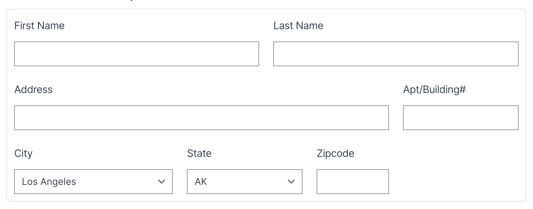
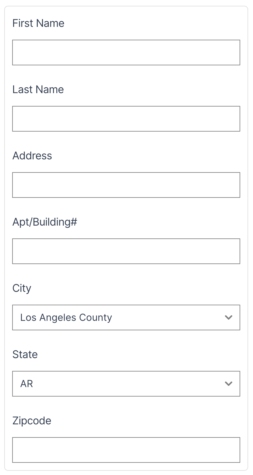
Here's a full example of an address form layout for a mobile device and a sm device size screen.
<div id="demo-main">
  <form>
    <div class="grid grid-cols-1 sm:grid-cols-12 gap-6">
      <div class="flex-col sm:col-span-6 space-y-3">
        <label class="block">First Name</label>
        <input type="text" class="w-full" />
      </div>
      <div class="flex-col sm:col-span-6 space-y-3">
        <label class="block">Last Name</label>
        <input type="text" class="w-full" />
      </div>
      <div class="flex-col sm:col-span-9 space-y-3">
        <label class="block">Address</label>
        <input type="text" class="w-full" />
      </div>
      <div class="flex-col sm:col-span-3 space-y-3">
        <label class="block">Apt/Building#</label>
        <input type="text" class="w-full" />
      </div>
      <div class="flex-col sm:col-span-4 space-y-3">
        <label class="block">City</label>
        <select class="w-full">
          <option value="Los Angeles">Los Angeles</option>
	        <option value="Los Angeles County">Los Angeles County</option>
        </select>
      </div>
      <div class="flex-col sm:col-span-3 space-y-3">
        <label class="block">State</label>
        <select class="w-full">
          <option value="AK">AK</option>
          <option value="AL">AL</option>
          <option value="AR">AR</option>
          <option value="AZ">AZ</option>
        </select>
      </div>
      <div class="flex-col sm:col-span-2 space-y-3">
        <label class="block">Zipcode</label>
        <input type="text" class="w-full" />
      </div>
    </div>
  </form>
</div>
Here's the rendered output for both mobile and desktop views.
Small device to desktop
Mobile view
In Conclusion
So we've seen many examples of how Tailwind's grid system can be used for various types of layouts and arrangements. It's really been a game changer and makes using CSS grid so much easier.
A good rule of thumb is to use it for anything that needs row and column like structuring. Anything else can use Tailwind's powerful flex utilities to do the fine tuning.
I have to say that after many years of developing websites and apps, we've come a long way since having to use float left or right to align and create column like effects. I'm just glad that we finally have a variety of tools for such precision in layouts and Tailwind grid system definitely is a great tool to have for the job.